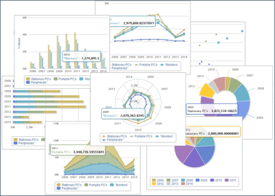
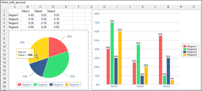
You can create dynamic charts In Jedox Spreadsheets by going to Insert > Chart...
You can also install the Chart Samples Model from Jedox Marketplace for further information on what each chart represents, and how you can implement that chart.
Numbers on chart axes and in labels can be formatted as percentages for most chart types. Tooltips use the same formatting as data labels. Dynamic charts are included in exports to PDF and HTML files.
Note: when you print a chart to PDF/HTML or XLSX, all data series are included. If you hide a series, your selection in the browser is ignored.
Data sources
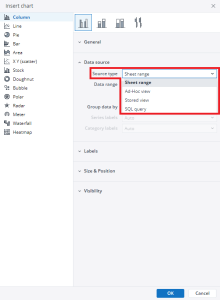
Data sources are defined in the Insert Chart dialog:
The following data sources can be used for a chart:
|
Sheet range |
named range |
|
Ad hoc View |
Create a new Jedox ad hoc view to use as the source |
|
Stored View |
Select a stored global or private view. Notes:
|
|
SQL Query |
Enter a SQL query of a connected database |
Note that when you are making charts from the Jedox Views, it is always recommended to use a Stored View or an Ad hoc View in the Source type of the chart.
You can also use a Jedox function, PALO.VIEW.TABLE, to create a chart with a Jedox View that is already in a sheet.
Additional formatting options for dynamic charts
Dynamic charts offer a series of additional options for formatting.
Data Series Formatting
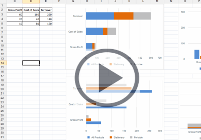
You can change both the format and the chart type of individual data series in a chart. This also enables you to use several chart types in a single chart object. For example, you can combine a column and a line series to generate a Pareto chart. To format the data series in a dynamic chart, follow these steps:
- Right-click the chart element that you want to format.
- Select Format Data Series. A dialog is displayed, allowing you to select general options, options for labels, numbers and font.
- Click OK. The changes are visible in the dynamic chart.
Editing the Axis settings
You can reverse the order of the categories on the axis when you create stacked charts. To do this, follow these steps:
- Right-click the axis of your chart.
- Select Format Axis from the context menu. The Edit Axis dialog is displayed.
- On the Edit Axis dialog, select one of the following options:
Reversed
Reverses the axis, moving the highest value closest to the origin.
Reversed Stacks
If selected, it moves the first series in a stack on top in a positive, non-reversed Y axis. If it is not selected, the first series is at the base of the stack.
Editing the Legend settings
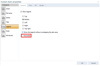
You can reverse the order of the elements when you create stacked charts. To do this, follow these steps:
- Right-click the chart.
- Select Format Chart Properties. The formatting dialog is displayed.
- Go to Legend and select Reversed. This reverses the order of the legend elements to match the order of the series displayed in the chart.
Tooltip formatting
To format the tooltip in a dynamic chart, follow these steps:
- Right-click on the tooltip.
- Select Format Axis. A dialog is displayed, allowing you to select options for the scale, numbers and font.
- Click OK. The changes are visible in the dynamic chart.
Charts from XLXS files are imported as dynamic charts in Jedox Web, and dynamic charts are exported from Jedox Web to XLXS files. However, there are some constraints regarding the import from or export to XLXS files that you need to consider:
- Unit formatting of chart series labels (thousands, millions, percentage) is not supported in XLSX exports. For axis labels, it is supported.
- For existing charts, the default title string ="" (which would be visible in the chart in an XLXS export) has to be removed in the chart properties dialog. All new dynamic charts will be created without this default title.
- Some Jedox chart types don't exist in Excel and cannot be exported (not even as image).
The default color palette that is used in new charts can be defined in Jedox Web Administration under Settings > spreadsheet > Default series palette. You can change the value of the key called spreadsheet.charts.default_series_palette. Possible values are Shoal, Hydro, Copa, Office, Apex, Aspect, Chaplin, Jedox and Design System, representing the existing chart palettes. A change of the value will be applied in any new session in Jedox Web. For more information, see Jedox Chart Palettes.
Dynamic charts should not be crossed by Freeze Pane borders. Freeze Pane borders may cause various display errors.
If a dynamic chart is inserted in a spreadsheet in an area with hidden columns or rows, the chart will change its dimensions after unhiding. This also affects the appearance of the charts after an export as PDF.
Charts will not be moved dynamically in the spreadsheet if a row or column is hidden, or if the width/height of the rows or columns changes.
Example: Chart with percent
Regarding the display of percentage values for chart series labels, there are two ways that charts handle this:
- Some charts, such as pie charts, calculate percentage values on their own, based on the distribution of values in the chart source range.
- Other charts, such as the standard column chart, do not calculate percentages. You can still set these charts to show labels formatted as percentage, but they will simply re-format the raw value from chart source range. For calculating the proportions of the raw values up to 100%, please use the 100% Stacked Chart types.
- Stacked Bar Charts are designed for more than one data series. The sum of each bar segment is considered 100%. If you use only one data series, all the labels show 100%.
- The values between 0 and 1 are not automatically converted to percentages in Spark Pie charts anymore. If these values should be shown as percentages in the Spark Pie, they first need to be converted in the source (multiplied by 100).
Updated November 25, 2024
