Users frequently need to add new elements, such as employees or products, during the planning process. The Add/ Delete Action allows you to dynamically create or remove elements within a dimension.
Add element
You can use the Add Element Action in both the Jedox Spreadsheet and Canvas. To set this Action up in a spreadsheet, start by selecting a form element such as a Button, Checkbox, List, DatePicker, or Combobox. In Canvas, you should add a native component that supports Actions, such as a Combobox, Button, or Checkbox.
Below are the steps for configuring the Add Element Action for a Button in a spreadsheet. These steps are also applicable for setting up this Action in Canvas.
-
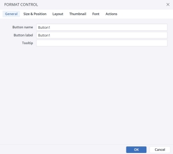
Navigate to the Insert menu and select the Button icon.
-
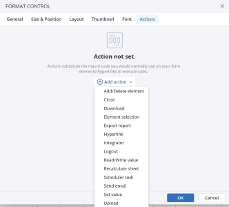
Click on the Actions tab and then choose Add action. Select the Add/Delete element action.
-
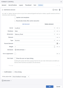
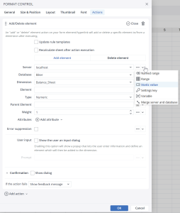
The next dialog provides several options for the Action. Using the close button, you can close the Action, and by clicking on the Bin icon you can delete the Action.
In this dialog, you can select the Weight, Parent Element, Type, Dimension, Database, and Server for the element you want to add. Additionally, you have the option to enter both the In-Memory DB connection and the database in a single merged field, rather than separately. This feature is particularly useful when using a single named range (or @variable), like "rngServer," which might contain a value such as "localhost/Demo."
-
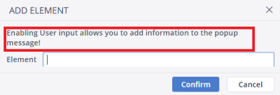
The User input option lets you provide additional information or a definition for the element being added to the dimension. This definition will then be displayed to the end user via a pop-up message.

Delete element
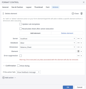
Clicking the Delete Element button opens the Delete Element dialog.
Here you can choose the Server, Database, Dimension, and Element that you want to delete.
Add/ delete element Confirmation dialog
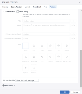
When you select the add/ delete element Action in the type of action dropdown menu, you'll find the "Confirmation dialog" option at the bottom of the Action settings.
In the "Confirmation dialog," you can personalize the message for the end user by adding a Title, Body, Primary button label, Secondary button label, and an Icon. The screenshot below illustrates an example of a customized confirmation message:
Action failure
You can choose between two options if an Action fails: either display a pop-up feedback dialog or proceed to the next Action without addressing the failure.
Updated November 4, 2024

